The question isn't "can a free logo maker produce something usable?" The answer to that is yes. The real question is what you're trading away when you use one — and whether that trade-off makes sense for where your business is going.
TL;DR
Free logo makers produce functional logos quickly and cheaply — for businesses where the logo's only job is basic identification
Professional design produces a strategic brand identity — a logo system built around your specific positioning, designed to signal the right quality tier, and delivered with the files and documentation needed to apply it consistently
The real cost of a free logo isn't the money saved upfront — it's the pricing ceiling, the conversion cost, and the rebrand you'll need to do when the business outgrows it
This guide covers what you're actually choosing between, when each approach makes sense, and what the professional process looks like
The False Economy Problem
A founder building a D2C supplement brand uses Canva or Looka to generate a logo. It looks decent. They launch, do some initial sales, run some ads. Everything seems fine.
Eighteen months later, they're trying to get their product stocked in a premium retail chain. The buyer looks at the packaging and passes. They're pitching to investors. The deck looks amateurish compared to the competition. They're running paid ads and wondering why their conversion rate is lower than benchmarks.
None of these problems would be solved by a better product. They're brand problems, and specifically they're first-impression problems. The visual identity — which they got "for free" — is communicating the wrong things to every person who evaluates the brand, every day.
The cost of the free logo isn't the zero rupees paid upfront. It's the pricing ceiling it creates, the conversion friction it generates, and the full rebrand investment required when the business reaches a stage where the stakes are high enough that it matters.
This is the false economy of free logo tools: they appear to save money at the start and actually cost more in aggregate over the life of the business.
What Free Logo Makers Actually Provide
It's worth being precise about what free logo tools do and don't offer, because the honest answer is "they provide something useful — just not what most founders think they need."
What they provide:
A mark. A symbol or wordmark that can be placed on a website, a social media profile, and a business card. It looks like a logo. It identifies the brand. For the most basic identification purposes, it works.
What they don't provide:
A brand identity system. A strategic fit between the visual language and the brand's positioning. Ownership and trademarkability of the resulting design. Vector files that can be scaled to any size without quality loss. Multiple logo versions for different applications. A colour palette with documented exact values. Typography specifications. Brand guidelines. Any of the documentation that allows a brand to be applied consistently by multiple people across multiple contexts.
The template problem is the most fundamental limitation. Every free logo maker draws from the same library of icons, typefaces, and visual elements. Your logo is one of thousands created from the same building blocks. In a category with multiple competitors, the probability that another brand has a visually similar logo is high. You cannot own something that's been generated from shared templates — which means you cannot trademark it, and you have no legal protection if a competitor uses a similar mark.
What the Visual Identity Communicates Before Anything Is Read
This is the strategic argument for professional design, and it's the one most founders underweight.
Before a potential customer reads your product claims, your ingredient list, your founder story, or your pricing — they've already processed your visual identity and formed a preliminary judgment about which quality tier you belong to.
This happens in under three seconds. It's not a conscious evaluation; it's a pattern recognition process that the brain runs automatically. The result is a price expectation and a quality expectation that everything else is then evaluated against.
A visual identity that looks like it was generated by a template tool communicates: this brand is at the commodity end of the market, where the most important variable is price. A visual identity that looks like it was designed with strategic intent — specific typefaces chosen deliberately, a distinctive colour palette applied with precision, a logo that feels like it belongs to exactly one brand — communicates: this brand is positioned at a specific quality tier and has invested in earning that position.
The commercial consequences are direct:
For a ₹99 product: a template logo is probably sufficient. The positioning is budget, the customer expects budget presentation, and the logo matches expectations.
For a ₹499–₹999 product: the template logo creates friction. The customer expects better presentation at this price point; a template logo triggers doubt about whether the product is worth the price.
For a ₹1,500+ product: a template logo is actively damaging. The visual presentation fails to justify the premium price, and a significant percentage of potential customers who would have bought the product based on quality choose not to because the brand's presentation doesn't match the price.
This is why the question "can I use a free logo?" is actually the wrong question. The right question is "does my visual identity match the price point and quality tier I'm trying to occupy?"
Related: Strategic Branding: The Secret Sauce for Premium Pricing
The Specific Problems With Template Logos in Practice
1. You Can't Trademark It
In India, trademark registration requires that the mark be distinctive — that it's not generic, not descriptive, and not previously registered. A logo built from shared template elements is difficult to trademark because the elements don't belong to you exclusively.
This means:
You have no legal protection if a competitor uses a similar mark
If you do build equity in the mark, you can't formally protect that equity
A competitor who commissions an original design can trademark their logo and then argue your template logo infringes on theirs
For a brand building long-term equity, this is a serious structural risk.
2. The Files Are the Wrong Format
Most free logo tools output JPEGs and PNGs — raster formats that are fixed in resolution. At small sizes, these look fine. At packaging scale, billboard scale, or even A4 print, they pixelate.
A professional logo is delivered as a vector file (AI, EPS, SVG) that can be scaled to any size without quality loss. Every printer, packaging supplier, and production house requires vector files for production-quality output. A brand that doesn't have vector files of its logo either needs to recreate the logo from scratch or pay someone to trace the raster version — both of which are additional costs.
3. No System for Consistent Application
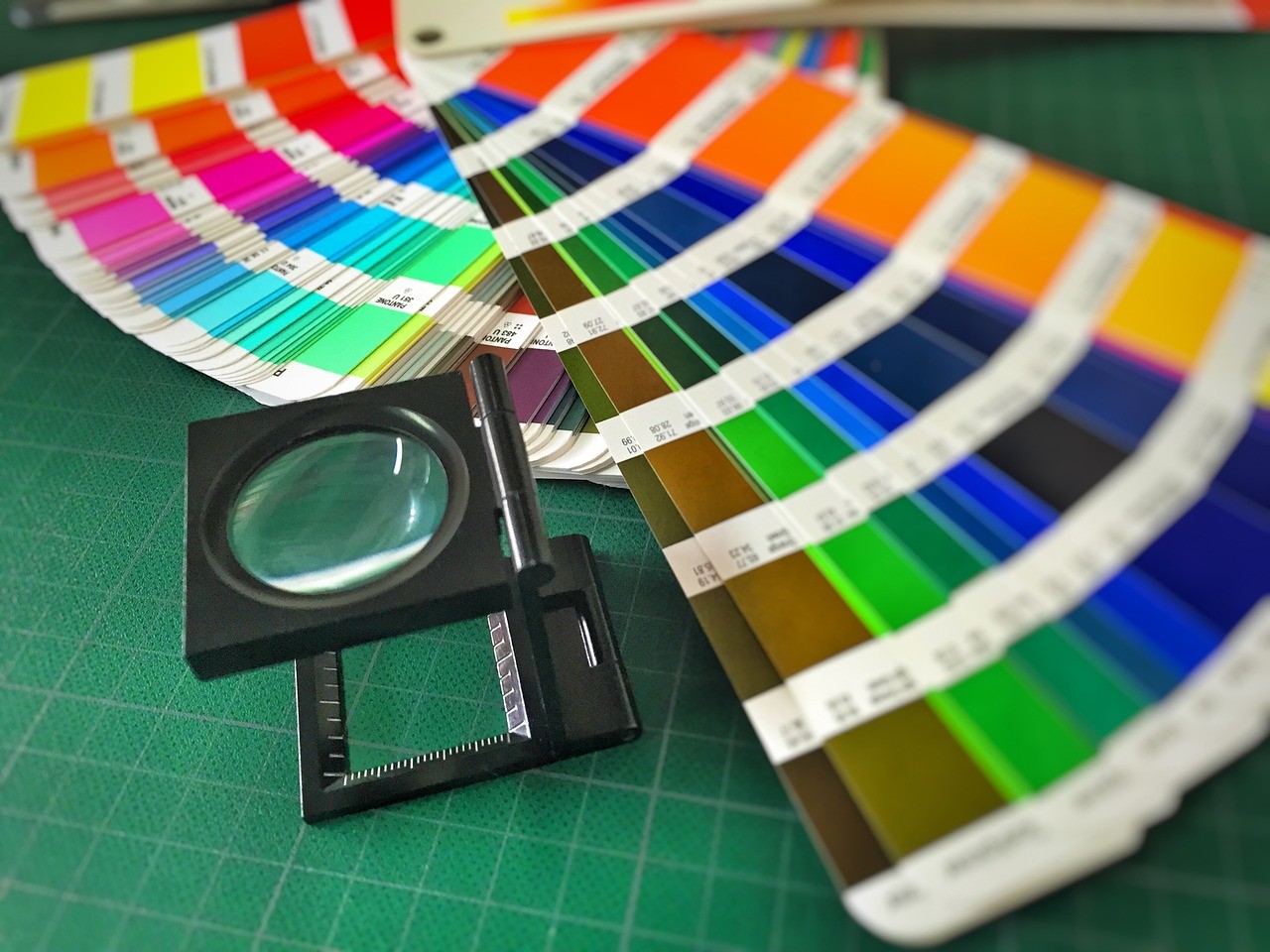
A single logo file is not a brand identity. A functional brand identity system includes: multiple logo versions for different contexts (horizontal, stacked, icon-only, reversed), exact colour values in HEX/CMYK/Pantone, typography specifications, and usage guidelines that tell anyone creating brand content how to apply the identity correctly.
Without this documentation, every person who creates a piece of brand content — a social media post, a packaging design, an email template — makes independent decisions about colours, fonts, and logo placement. The accumulated inconsistency over months and years erodes any recognition the logo has built.
4. Generic Positioning in a Crowded Category
In any crowded D2C category, visual distinctiveness is a competitive advantage. The brands customers remember and prefer are the ones with specific, owned visual identities that they can't confuse with alternatives.
A template logo, by definition, shares its visual building blocks with other brands using the same template library. In a category where multiple competitors are using similar tools, the visual landscape becomes homogeneous — and homogeneity is the enemy of brand recall.
What Professional Design Actually Involves
The misconception about professional logo design is that you're paying for the designer's taste or aesthetic skill. What you're actually paying for is a strategic process that produces a specific, owned outcome.
Step 1: Strategic Discovery
Before any design work, a professional designer or agency spends time understanding your business: your positioning, your target audience, your competitive context, what brands you admire (and why), what price tier you're competing in, and what you want your brand to communicate at first glance.
This work shapes every design decision that follows. A supplement brand targeting serious athletes needs to communicate precision, efficacy, and seriousness. A supplement brand targeting casual wellness consumers needs to communicate approachability, naturalness, and trust. The same category, but completely different visual strategies — and the difference only emerges from the strategic foundation.
Step 2: Competitive Landscape Research
A professional designer maps the visual landscape of your category before designing. They identify what colours, typefaces, and visual styles are overused by competitors — so your brand can differentiate visually, not just verbally.
This is the difference between a logo that looks like it belongs to the category and a logo that stands out within it. Both require category knowledge; only one requires research.
Step 3: Concept Development
Initial design concepts are developed based on the strategic brief — not from template libraries, but from original creative work. Multiple directions are explored, each anchored to a different facet of the positioning.
Step 4: Refinement
The chosen direction is refined through a structured feedback process. The designer explains the rationale behind each choice — why this typeface, why this colour, why this visual approach — and adjusts based on feedback that's evaluated against the strategic brief.
Step 5: System Development and Delivery
The final logo is developed into a complete identity system: multiple versions, colour specifications, typography guidelines, and usage documentation. The full file package is delivered: vector source files, PNG/JPEG exports at multiple resolutions, and brand guidelines.
This is what you're paying for: not a single image, but a strategic system built for a specific brand and delivered with everything needed to apply it consistently.
When a Free Logo Makes Sense
In the interest of honesty: there are situations where a free logo is the right choice.
Pre-validation stage. If you're testing a product concept before committing to a brand, a placeholder logo from a free tool is perfectly appropriate. Don't invest in professional brand identity until you've validated that the product has market demand.
Internal projects or side projects. Not every project needs a professional brand identity. A free logo is fine for a project where the stakes are low and the audience is limited.
Extreme budget constraints. If you genuinely cannot afford professional design, a free tool is better than nothing. But factor in the timeline for upgrading — plan to commission professional brand identity as soon as the business can support it, before the brand reaches a stage where the cost of the rebrand is compounded by the disruption to established assets.
In all other cases — any brand that's commercially serious, any brand competing on quality rather than price, any brand planning to raise investment — professional design is the right investment.
What Professional Logo Design Costs in India
The range is wide, and the range within professional design is as wide as between free tools and professional design.
Entry-level freelance: ₹5,000–₹20,000. A logo only, no system, limited revisions. Appropriate for very early-stage brands where any professional mark is better than a template.
Mid-range studios and agencies: ₹40,000–₹1,00,000. Complete identity system including logo, colour palette, typography, brand guidelines, and multiple file formats. This is the appropriate range for most D2C brands at the growth stage.
Strategic branding agencies: ₹1,50,000+. Full brand strategy, positioning work, identity system, and comprehensive application guidelines. Appropriate for brands raising investment or entering premium distribution channels where brand equity needs to be bulletproof.
At Miracle Studio, brand identity work starts around ₹40,000 for a complete system — logo, colour, typography, guidelines, and all file formats delivered within the 28-hour first delivery promise.
FAQ: Free Logo Makers vs Professional Design
Can I trademark a logo made with a free tool? Difficult and often not possible. Free logos are built from shared template elements that aren't exclusively yours. For trademark registration in India, your mark needs to be distinctive and original. A logo built from shared templates is neither.
What file formats do I need from a professional designer? At minimum: vector source files (AI or EPS), SVG for web, and PNG exports at multiple resolutions (transparent background). Your packaging supplier, printer, and web developer will all need specific formats — make sure these are explicitly part of the delivery scope before you sign.
Is it worth upgrading from a free logo mid-journey? Yes — but do it before a major milestone, not after. The best timing for a brand identity upgrade is before scaling paid acquisition, before approaching investors, or before entering new distribution channels. Each of these moments involves significant brand exposure, and you want the identity to be right before you multiply that exposure.
How do I brief a designer if I don't know what I want? Start with reference brands — not in your category necessarily, but brands whose visual language feels right for how you want to be perceived. Explain what you like about each reference and what specifically you're trying to communicate. A good designer will ask the right questions to fill the gaps. See our full guide: How to Brief a Designer: A D2C Founder's Complete Guide.
What's the difference between a logo and a brand identity? A logo is a mark. A brand identity is a system — the logo plus colour palette, typography, visual language, guidelines, and all the documentation that makes the mark applicable consistently across every context. Professional design delivers a system; free tools deliver a mark.
Conclusion: You're Not Choosing Between Cheap and Expensive
You're choosing between two things with fundamentally different strategic implications.
A free logo tool produces a mark for identification. A professional brand identity is a strategic system that communicates your positioning, signals your quality tier, builds recognition through consistent application, and creates the kind of first impression that either earns the price you're asking or undermines it.
For a business where the logo's only job is basic identification — a pre-validation test, a side project, a business that will always compete on price — free is the right choice.
For a business building brand equity, competing on quality, planning to raise investment, or trying to hold a premium price point against generic alternatives — professional design is not a luxury. It's the infrastructure that makes every other investment in the business more efficient.
The logo is where customers start. Make sure what they find is what you want them to see.
If you're ready to commission a brand identity that works as hard as your product does, book a call with Miracle Studio.
Miracle Studio is a brand identity and packaging design agency based in Faridabad, India. No retainers, no lock-ins, 28-hour first delivery. See our work or get in touch.