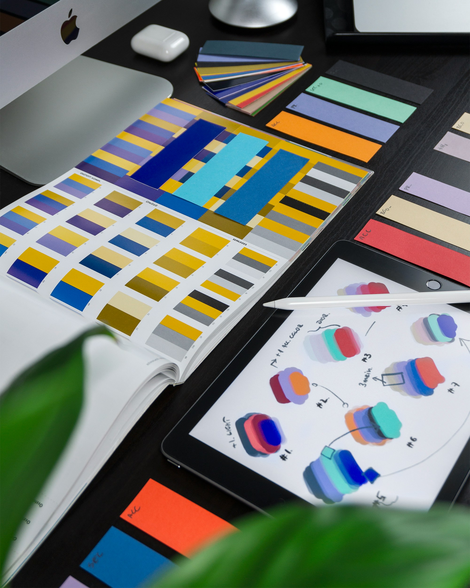
Color is one of the most efficient visual shortcuts to your brand. Research shows that 52% of consumers first notice the color on packaging before anything else. This powerful element not only captures attention but also communicates emotions, product qualities, and brand values.
When used strategically and consistently, color can become an impactful visual tool that builds brand recognition. However, poor or mismatched color choices can confuse consumers and diminish brand appeal. In this blog, we’ll explore how to harness the power of colors in branding and packaging design, covering best practices and potential pitfalls to avoid.
Why Color Psychology Matters in Branding
Color psychology is the study of how colors influence human emotions, behaviors, and decisions. Each color triggers specific feelings and associations, making it a critical tool for brands to convey their message effectively.
Key Emotional Triggers of Colors:
Red: Excitement, passion, urgency (often used by food and retail brands).
Blue: Trust, calmness, professionalism (popular among financial and tech brands).
Green: Health, nature, growth (preferred by eco-friendly and wellness brands).
Yellow: Optimism, energy, happiness (used to grab attention or convey positivity).
Black: Sophistication, luxury, power (common in premium branding).
Best Practices in Using Colors for Branding and Packaging
1. Signature Colors
Iconic brands like Tiffany & Co. have signature colors that they use consistently across all touchpoints—packaging, advertising, and more. These signature colors create a strong association between the brand and the hue. When choosing a signature color, ensure it aligns with your brand’s essence and messaging.
Tip: Invest in trademarking your signature color if it becomes an integral part of your brand identity.
2. Align Colors with Tone and Brand Story
Your packaging colors should reflect the personality of your brand. For instance:
Bright, saturated colors communicate fun and youthfulness.
Neutral, earthy tones convey calmness and wholesomeness.
Metallic shades like gold and silver can signify luxury and innovation.
3. Convey Product Qualities
Colors can be a proxy for product attributes, especially in packaging with minimal imagery. For example:
Warm tones (e.g., brown, orange) evoke flavors like chocolate or cinnamon.
Cool tones (e.g., green, blue) signify freshness or natural ingredients.
Example: A brand selling organic snacks can use earthy greens and browns to emphasize natural ingredients.
Common Pitfalls to Avoid in Color Selection
1. Misaligned Messaging
Colors that contradict your brand’s tone can confuse consumers. For example, a healthcare brand using playful, neon colors might struggle to convey professionalism and trust.
2. Bland or Washed-Out Designs
Packaging with poor color contrast (e.g., yellow on white) can appear unappealing and fail to stand out on shelves. It’s vital to balance colors to maintain both visual clarity and shelf impact.
3. Overreliance on Bright Colors
While bright colors can attract attention, they aren’t always appropriate. Premium brands like whiskey rely on muted, sophisticated tones to convey quality and heritage.
4. Challenges with CMYK Printing
Cost-saving measures like switching to CMYK printing can sometimes result in colors that don’t match your brand’s intended look. Bright oranges or greens, for instance, can be difficult to replicate. Additionally, printing on different substrates can alter how colors appear. Be sure to test your designs across various materials and finishes.
Why Color Consistency is Crucial
Consistency in color usage builds brand recognition and trust. It ensures that your packaging and branding materials are instantly recognizable to your audience.
Practical Tips for Maintaining Consistency:
Use Brand Guidelines: Define your brand’s color palette and ensure all materials adhere to it.
Conduct A/B Testing: Test different color schemes to determine which resonates most with your audience.
Work with Experts: Partnering with a professional branding and packaging agency ensures your color choices align with your brand’s goals.
How Small Businesses Can Leverage Color Psychology
Small businesses can use color strategically to create a strong impression without large budgets. Here’s how:
Highlight Brand Values: Use colors that reflect your mission and product qualities (e.g., green for sustainability).
Connect with Local Audiences: Tailor color schemes to resonate with regional preferences and cultural significance.
Stand Out on Shelves: Select colors that differentiate your product from competitors.
Example: In India, red and gold are culturally significant and often used in festive or premium packaging.
Conclusion
Color is more than just an aesthetic choice—it’s a strategic tool that can elevate your branding and packaging. The right color choices can attract attention, convey key product qualities, and create emotional connections with your audience. Conversely, poor choices can undermine your brand’s message and appeal.
At Miracle Studio, we specialize in crafting color-driven branding and packaging strategies that leave a lasting impression. Whether you’re revamping your brand or launching a new product, our team of experts is here to guide you in making impactful color decisions.
Ready to elevate your brand with the power of color? Contact us today to start your journey!


